Welcome to the June Creating Design Team blog hop. We are excited to have Eva Dobilas from Canada as our Guest Designer. Check out her fab blog here. Our theme for June is Landscapes. You are going to see some fabulous works of art from the rest of the team but for the last few weeks I've had a nasty head cold thingy that has drained all of my creativity. So when I was thinking about what to do, surprise, surprise, my brain went off on a weird tangent as it usually does and I got stuck on the idea of landscape orientation. So my card is plain and not nearly as arty as the rest but hopefully I will make up for it by giving you a neat little trick for extending die cuts.
So this is my card. I've used lots of fab new products from the new 2019-2020 Annual Catalogue from Stampin' Up!.
Isn't that Stitched Lace die cut piece just gorgeous? There are 2 dies - one cuts the main part and the other cuts out the edge. And the neat thing is that it works on every edge! The main die is about the size of a regular card front but because it has a repeated pattern it is really easy to use on bigger pieces.
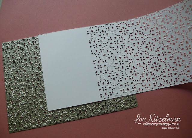
Start with the die lined up with the top and one end edge. I have turned my die over in this pic to show you. This die has loads of little cut out bits so before you take the paper off the die, spend some time with a die brush to get out most of the little bits.
Then you take the partially die cut piece and move it along so the the rest of the panel will be cut by the die. Line up the existing holes with the die so that you get a seamless die cut panel. I had plans to do a video but I keep loosing my voice and still have a terrible cough so thought I would spare you!
My card fits into a business size envelope which is still regular postage in Australia. I cut my cardstock for the card base 21 cm x 21 cm and scored at 10.5 cm. If you are not using A4 cardstock as I did and are using Letter size cardstock, cut yours at 8 1/2" x 8 1/2" and score at 4 1/4". My die cut piece is the length of the card and I played around with the width. I started out with a piece that was 9.5 cm (3 1/2") wide.
The Daisy is from the new Daisy Lane stamp set and coordinates with the Daisy punch. As I said this is a really simple card and if I was feeling better I am sure I would have added in a sentiment but I also like that this simple design lets the lace die cut be the star of the show along with the Rococo Rose elements.
I am certain my 'landscape' will be different from the rest of the design team but I hope that you liked seeing a way to extend your die cuts. Have a look at the rest of your collection and see what else you can use in this way.
Make sure you continue the blog hop. Next up is the fabulous Jay Soriano. Can't wait to see his landscape!
Lou
Product List


Wowsa, this is gorgeous Lou ... and that fabulous lacey die has just bumped further up my wish list! :) xxx
ReplyDeleteForget plain or arty... it's a beautiful card, Lou!
ReplyDeleteThis is so gorgeous!!! Love your take on the landscape....they didn't say it can't be orientation...LOL...love how you extended the die's capability!!!
ReplyDelete