Warning - don't spend too long looking at our gorgeous colour combination pic if you are on a diet! Believe me .... it is hard to focus and get creative! Maybe just take a quick peep!
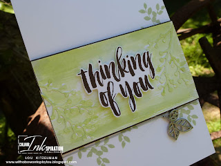
It is always sad when you need to make a sympathy card. I always find it hard to know what to say in the card so I always hope that the love and time I put into the card somehow conveys how truly sorry I am for the loss suffered. I used our colours for this card in the hope that it was not too sombre and I think I got the ratio of each right.
This was one of those cards that started off in one direction and ended up in a totally different one. The sentiment panel originally had the sentiment stamped in Soft Sea Foam, the die cuts adhered, then embossed with the Subtle embossing folder. It looked at bit .... dull! So I watercoloured over with a light wash of Granny Apple Green. The ink caught in the different textured parts which I quite liked however the sentiment didn't stand out enough. Restamping in Early Espresso and fussy cutting before adhering with dimensionals was an easy fix!
Some Soft Sea Foam foliage coming out from under the sentiment panel with some silver metalic thread and leaf finished off my design.
INKspired to join the challenge? It's so easy. Firstly, get some INKspiration by hopping around to see what all of the Colour INKspiration Crew have to show you. Then you have 12 days from today to make and upload your creation to the Facebook Colour INKspiration Group. You don't have to have a blog to participate but if you do you can link back to your post. Make sure you use all of the challenge colours. You can also use Whisper White, Very Vanilla and Basic Black as well as Metallics. Not a member of the Facebook group yet? Just click here and ask to join Colour INKspiration, add the group to your favourites and share it with your crafty friends so they can join in the fun too. We can't wait to see what you create with these gorgeous colours.
Next up we have the lovely Leonie. Make sure you check out her take on this colour combination. You will love it!
Lou
Lou
Product List


Beautiful Lou, and so is the card! I do really like the watercoloured panel, all the changes you made really paid off.
ReplyDeleteLove the watercoloured panel in the background. So simple and pretty. Great journey with the creativity! Perfect colours for this type of card.
ReplyDeleteGorgeous Lou. I rally love this stamp set and it is the perfect choice for this challenge Beautiful 😍
ReplyDeleteFussy cutting the sentiment and popping it up is very effective. I think these colours are great for a sympathy card - somehow the greens suggest there's some hope while the dark brown keeps it sober.
ReplyDeleteBeautiful card and I love how you've used these sets together.
ReplyDelete